

TL;DR:
- The best Power BI alternative depends on the specific problem you aim to solve and your migration trigger.
- You should prioritize architecture, TCO, and embedding needs over features, choosing tools like Tableau, Looker, Sigma, or ThoughtSpot based on your requirements.
Pick your replacement based on the problem you’re actually solving. There is no single best Power BI alternative — the right tool depends on your migration trigger. Here is a fast shortlist mapped to the most common ones:
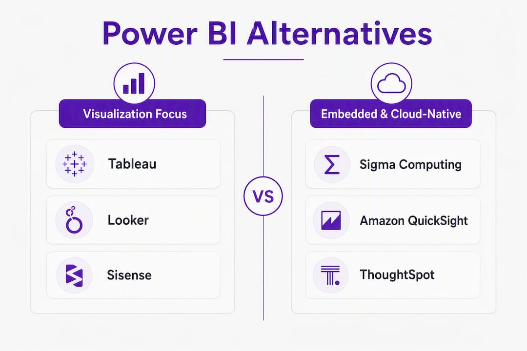
- Visualization depth: Tableau
- Governed semantic layer (code-defined): Looker (Google Cloud)
- Warehouse-native, spreadsheet-style self-service: Sigma Computing
- AI/natural-language search: ThoughtSpot
- Open-source / self-hosted: Metabase or Apache Superset
- Embedded customer-facing analytics: Sisense or Sisense Fusion Analytics
- Single-vendor pipeline + dashboards: Domo
- Budget-conscious SMB or Zoho ecosystem: Zoho Analytics or Klipfolio
If you are deep in Microsoft 365 and Azure, Power BI may still be your best option. Migrate when architectural constraints or cost step-changes make staying genuinely expensive or limiting.
Table of Contents
- How the top Power BI alternatives compare side by side
- Profiles of every major alternative: what each tool actually does well
- Why teams leave Power BI: the real migration triggers
- How to choose: an evaluation checklist for your shortlist
- Migration costs, timeline, and what teams consistently underestimate
- How Toolsplorer evaluated and scored these alternatives
- Key Takeaways
- When to stay on Power BI and when to actually leave
- Toolsplorer cuts your shortlisting time significantly
- Useful sources for deeper research
- FAQ
How the top Power BI alternatives compare side by side
The table below covers the leading BI platforms on the dimensions that matter most in a buying decision. Pricing signals are directional; always model your own viewer/author counts before committing.
| Tool | Best for | Deployment | Pricing signal | Ease of use | Scalability | Semantic layer | Governance | AI / search | Embedding APIs |
|---|---|---|---|---|---|---|---|---|---|
| Tableau | Visual analytics, bespoke charting | Cloud, on-prem, embedded | $$$$ | Moderate | High | Tableau Semantic Layer | Strong | Einstein AI (Salesforce) | Tableau Embedded |
| Looker (Google Cloud) | Governed enterprise metrics via LookML | Cloud (GCP) | $$$$ | Steep (LookML) | Very high | LookML (code-defined) | Very strong | Looker AI features | Strong APIs |
| ThoughtSpot | NLQ / search-driven self-service | Cloud, embedded | $$$ | Low (NLQ) | High | ThoughtSpot Modeling Layer | Strong | SpotIQ AI engine | Embedded ThoughtSpot |
| Sigma Computing | Warehouse-native, spreadsheet UX | Cloud | $$$ | Low | Very high (warehouse-native) | Warehouse-native | Moderate | AI formulas | Moderate |
| Domo | End-to-end pipeline + dashboards | Cloud | $$$$ | Moderate | High | Domo Semantic Layer | Strong | Domo AI | Strong |
| Sisense / Sisense Fusion Analytics | Embedded, multi-tenant analytics | Cloud, on-prem, embedded | $$$$ | Moderate | High | Sisense ElastiCube | Strong | Sisense AI | Best-in-class |
| Qlik Sense | Associative exploratory analysis | Cloud, on-prem | $$$ | Moderate | High | Qlik associative engine | Strong | Insight Advisor AI | Strong |
| Metabase | Low-cost self-hosted BI | Cloud, self-hosted | $ (OSS) / $$ | Low | Moderate | SQL-based | Basic | Limited | Basic (Pro) |
| Apache Superset | Engineering-backed self-hosted BI | Self-hosted | Free (OSS) | High (engineering) | Moderate | SQL/dbt | Basic | Limited | Customizable |
| Zoho Analytics | Zoho ecosystem, budget BI | Cloud | $ | Low | Moderate | Zoho semantic layer | Moderate | Zia AI | Moderate |
| MicroStrategy | Enterprise governance and reporting | Cloud, on-prem | $$$$ | Steep | Very high | HyperIntelligence | Very strong | MicroStrategy AI | Strong |
| Amazon QuickSight | AWS-native serverless BI | Cloud (AWS) | $$ | Low–moderate | High (AWS-native) | SPICE engine | Moderate | Q (NLQ) | Moderate |
| Databox | Marketing/sales dashboards | Cloud | $$ | Very low | Low–moderate | Connector-based | Basic | AI Assist | Basic |
| Klipfolio | SMB executive dashboards | Cloud | $ | Low | Low | Connector-based | Basic | Limited | Basic |
| Mode | SQL/Python/R analyst workflows | Cloud | $$ | Moderate (SQL) | Moderate | SQL-based | Moderate | Limited | Moderate |
| Dot | Automated narrative reports | Cloud | $$ | Very low | Moderate | AI-driven | Basic | AI-first | Basic |
| SAP Analytics Cloud | SAP-centric enterprise analytics | Cloud | $$$$ | Steep | High | SAP semantic layer | Very strong | SAP AI | Moderate |
| SAP BusinessObjects BI Suite | Legacy SAP pixel-perfect reporting | On-prem, cloud | $$$$ | Steep | High | Universe semantic layer | Very strong | Limited | Moderate |
| QlikView | Guided analytics, legacy Qlik apps | On-prem | $$$ | Moderate | High | Qlik associative engine | Strong | Limited | Moderate |
| Strategy One | Consultancy-led BI deployments | Varies | $$$ | Moderate | Moderate | Varies | Moderate | Limited | Moderate |
Key trade-offs to keep in mind:
- Best for Mac/browser-first teams: Sigma, Metabase, ThoughtSpot, and Apache Superset are all browser-native, eliminating the Windows-only friction of Power BI Desktop.
- Best for governed enterprise metrics at scale: Looker’s LookML and MicroStrategy’s HyperIntelligence both enforce a single version of truth, but Looker requires significant LookML investment upfront.
- Best for cost-sensitive teams: Metabase (open-source) and Zoho Analytics offer the lowest entry costs, though open-source ops overhead can close that gap quickly.
Profiles of every major alternative: what each tool actually does well
Tableau
Tableau is the industry benchmark for expressive, exploratory visualization. Its drag-and-drop interface handles chart types that most BI tools cannot match, and the Tableau Semantic Layer (formerly Tableau Data Model) lets teams define metrics centrally. The Salesforce acquisition brought Einstein AI features, though they are still maturing.

Pros: Unmatched chart variety; strong community and training ecosystem; Tableau Prep handles light ETL; Salesforce CRM integration is native.
Cons: Expensive at enterprise scale; Tableau Desktop is not browser-native (though Tableau Cloud is); DAX-to-Tableau migration requires rebuilding calculated fields.
Best for: Teams migrating because Power BI’s visualization ceiling is too low, or those moving off Salesforce Reports into a unified analytics layer.
Looker (Google Cloud)
Google acquired Looker for $2.6 billion and positioned it as the governed analytics layer for Google Cloud Platform. LookML, its code-defined semantic modeling language, is genuinely powerful for version-controlled metric governance. The trade-off: your team needs engineers who will write and maintain LookML.
Pros: Version-controlled semantic layer; tight BigQuery integration; strong API surface; excellent governance.
Cons: Steep LookML learning curve; expensive; not ideal for ad hoc self-service by business users.
Best for: Enterprises that want a single, auditable definition of every business metric and are already on GCP.
ThoughtSpot
ThoughtSpot built its product around natural-language search and AI-assisted insight generation via its SpotIQ engine. Business users type questions in plain English and get charts back. That model works well for self-service in organizations where most users are consumers, not builders.
Pros: NLQ lowers the barrier for non-technical users; SpotIQ surfaces anomalies automatically; strong embedding SDK.
Cons: Complex data models can confuse NLQ; pricing scales with data volume; requires a clean, well-modeled data source to shine.
Best for: Organizations where business users need self-service analytics without learning DAX or SQL.
Sigma Computing
Sigma runs directly on your cloud data warehouse (Snowflake, BigQuery, Databricks, Redshift) and presents a spreadsheet-like interface over live data. Finance and ops teams that live in Excel find the transition natural. Because compute stays in the warehouse, there is no data extract to manage.

Pros: Warehouse-native means no stale extracts; spreadsheet UX reduces retraining; browser-based (OS-agnostic).
Cons: Requires a cloud warehouse; less mature visualization library than Tableau; governance features are still developing.
Best for: Finance and ops teams on Snowflake or BigQuery who want live, governed data without rebuilding their spreadsheet workflows.
Domo
Domo combines data ingestion, ETL, and dashboarding in one platform. Teams that want to reduce the number of vendors in their data stack find this appealing. The built-in connector library is extensive, and Domo AI adds automated insight generation.
Pros: End-to-end platform reduces integration overhead; strong connector library; Domo AI for automated insights.
Cons: Premium pricing; vendor lock-in risk; less flexible for complex semantic modeling than Looker.
Best for: Teams that want a single-vendor solution from raw data to executive dashboard, without assembling a separate ETL tool.
Sisense and Sisense Fusion Analytics
Sisense built its reputation on embedded analytics. The ElastiCube in-memory engine handles large datasets, and the API-first architecture supports multi-tenant white-labeled deployments. Sisense Fusion Analytics extends this with a more modular, cloud-native embedded approach.
Pros: Best-in-class embedding APIs; multi-tenant architecture; strong developer documentation.
Cons: Not ideal for internal self-service BI; pricing is enterprise-tier; requires developer investment.
Best for: Product teams building customer-facing analytics features inside SaaS products.
Qlik Sense and QlikView
Qlik’s associative engine lets analysts explore data relationships that SQL-based tools miss. Clicking a value in one chart instantly filters every other chart, including showing what is excluded, which is genuinely useful for root-cause analysis. QlikView is the older guided-analytics product; Qlik Sense is the modern self-service platform.
Pros (Qlik Sense): Associative exploration; strong governance; Insight Advisor AI; active community.
Cons: Moderate learning curve; QlikView is legacy and migration to Qlik Sense is its own project; pricing is not entry-level.
Best for: Analyst-heavy teams that need to explore complex, multi-table relationships beyond what SQL queries surface naturally.
Metabase
Metabase is the fastest path to a working dashboard for a non-technical team. The open-source version deploys in under an hour on Docker, and the question builder requires no SQL. The hosted cloud version removes ops overhead entirely.
Pros: Fast setup; friendly UI; open-source (free self-hosted); SQL optional.
Cons: Limited semantic layer; governance features are basic; self-hosted ops can exceed hosted costs once engineering time is factored in.
Best for: Startups and small teams that need dashboards quickly and cannot justify enterprise BI licensing.
Apache Superset
Apache Superset is the engineering team’s open-source BI tool. The visualization library is wide, the permissive Apache 2.0 license means no vendor fees, and it integrates cleanly with dbt for semantic layer management. Running it well requires a team that can manage infrastructure.
Pros: Free; highly customizable; strong dbt integration; active open-source community.
Cons: Requires engineering capacity to deploy and maintain; governance is manual; no native NLQ.
Best for: Engineering-backed data teams that want full control over their BI stack and can absorb the operational overhead.
Databox
Databox focuses narrowly on marketing and sales dashboards. Its prebuilt connectors cover Google Analytics, HubSpot, Salesforce, and dozens of other common sources. Setup is genuinely fast, and the AI Assist feature flags metric anomalies.
Pros: Very fast setup; prebuilt marketing/sales connectors; affordable entry tier.
Cons: Limited data modeling; not suited for complex cross-functional analytics; scalability ceiling is low.
Best for: Marketing and sales teams that need quick, reliable dashboards without a data engineering dependency.
Klipfolio
Klipfolio is a cost-effective dashboard tool aimed at small teams and agencies. It does one thing well: pulling metrics from multiple sources into a clean executive view. It is not a full BI platform, but for teams that just need a live KPI screen, it avoids the overhead of enterprise tools.
Pros: Affordable; quick setup; good connector coverage for SMB use cases.
Cons: Limited analytical depth; no semantic layer; not suited for large datasets.
Best for: Small teams needing affordable, always-on executive dashboards without analytical complexity.
Zoho Analytics
Zoho Analytics integrates tightly with the broader Zoho suite (CRM, Books, Projects) and offers a surprisingly capable BI layer at a price point well below enterprise tools. Zia, its AI assistant, handles basic NLQ queries.
Pros: Affordable; native Zoho ecosystem integration; Zia AI for NLQ; decent visualization library.
Cons: Less capable outside the Zoho ecosystem; governance features are limited; not suited for very large datasets.
Best for: Teams already using Zoho apps who want integrated reporting without a separate BI platform.
MicroStrategy
MicroStrategy is one of the oldest enterprise BI platforms and its governance capabilities remain among the strongest in the market. HyperIntelligence embeds metrics directly into web pages and SaaS tools via browser extension, which is a genuinely differentiated delivery model.
Pros: Mature governance; HyperIntelligence for zero-click insights; strong security and audit trails.
Cons: High cost; steep learning curve; implementation typically requires a partner or dedicated team.
Best for: Large enterprises where governance, audit, and security compliance are non-negotiable requirements.
Amazon QuickSight
QuickSight is the natural choice for teams already running their data stack on AWS. Its SPICE in-memory engine accelerates queries, and the serverless pricing model (pay-per-session) can be cost-effective for organizations with many occasional viewers. The Q feature adds NLQ on top of SPICE datasets.
Pros: Tight AWS integration; serverless scaling; pay-per-session pricing can lower viewer costs; Q for NLQ.
Cons: Visualization library is less expressive than Tableau; semantic layer is basic; limited outside AWS.
Best for: AWS-native teams that want cost-effective BI without leaving the AWS console.
Dot
Dot takes a different approach: instead of dashboards, it produces narrative reports and automated business reviews. An AI layer interprets data and writes the story, which suits executives who want answers, not charts.
Pros: Narrative output reduces interpretation burden; automated reports; very low learning curve.
Cons: Limited for exploratory analysis; not a replacement for full BI; governance is basic.
Best for: Startups and exec teams that want decision-ready written summaries rather than self-service dashboards.
Mode
Mode combines a SQL editor, Python/R notebooks, and a report builder in one interface. Analysts write queries, build visualizations, and publish reports without switching tools. It sits closer to a data science workbench than a traditional BI platform.
Pros: SQL + notebook + reporting in one place; strong for analyst-driven workflows; version control.
Cons: Not suited for non-technical business users; limited self-service; governance is basic.
Best for: Analyst teams that need SQL, Python, and R workflows integrated with shareable reports.
SAP Analytics Cloud and SAP BusinessObjects BI Suite
SAP Analytics Cloud is the forward-looking platform for SAP-centric enterprises, combining analytics with planning and forecasting. SAP BusinessObjects BI Suite is the legacy reporting layer for organizations that need pixel-perfect formatted reports from SAP data sources. Both carry enterprise pricing and steep implementation requirements.
Best for SAP Analytics Cloud: Organizations with large SAP ERP footprints that need integrated analytics and planning.
Best for SAP BusinessObjects: Enterprises with existing BusinessObjects investments and pixel-perfect reporting requirements.
Strategy One
Strategy One (formerly MicroStrategy’s consulting arm, now a distinct positioning) focuses on consultancy-led BI deployments where architecture design and implementation support are as important as the software itself.
Best for: Teams that need a guided, consultancy-driven approach to BI architecture rather than a self-service platform.
Why teams leave Power BI: the real migration triggers
The decision to switch is almost always architectural, not cosmetic. Teams rarely leave because of a missing chart type. They leave because the platform’s constraints are costing them money or engineering time.
Common triggers:
- Fabric capacity pricing. Moving from per-user Power BI Pro to Fabric capacity (F-series SKUs) can cause a significant step-function cost increase at scale. Teams with many viewers but few authors often find the per-user model expensive and the capacity model hard to predict.
- DAX complexity and model sprawl. DAX is powerful but unforgiving. Large organizations accumulate hundreds of measures across dozens of datasets, and without a governed semantic layer, definitions drift. Teams migrating to dbt or LookML are often doing so to escape this sprawl.
- Windows-only Power BI Desktop. Mac-heavy or distributed teams face real friction: workarounds include VMs, Parallels, or restricting authoring to Windows machines. Browser-native tools eliminate this entirely.
- Performance at scale. Import-mode datasets have size limits, and DirectQuery can be slow without careful optimization. Warehouse-native tools like Sigma push compute back to Snowflake or BigQuery, where it belongs.
- Embedding limitations. Building customer-facing analytics with Power BI Embedded requires A-SKU capacity licensing and has meaningful API constraints. Sisense and ThoughtSpot were built for embedding from the start.
- Microsoft ecosystem lock-in. For teams moving off Azure or diversifying their cloud stack, Power BI’s tight Microsoft dependency becomes a liability.
Which trigger points to which category:
- Warehouse-first migration → Sigma, Mode, or Apache Superset
- Visualization ceiling → Tableau
- Governed semantic layer → Looker
- AI/search self-service → ThoughtSpot
- Embedded analytics → Sisense, Sisense Fusion Analytics
- Cost reduction → Metabase, Zoho Analytics, Amazon QuickSight
How to choose: an evaluation checklist for your shortlist
Start with architecture, not features. Decide where your semantic layer should live (inside the BI tool, in the warehouse via dbt, or in a dedicated metrics layer) before you evaluate any vendor’s feature list. That single decision eliminates half the field.
Must-have checklist:
- Semantic layer strategy: does the tool support your chosen approach (LookML, dbt metrics, warehouse-native, or tool-native)?
- Viewer vs. author pricing: model your actual ratio. A tool that charges per viewer is expensive at 500 viewers; a capacity model may be cheaper.
- Embedding requirements: if you need customer-facing analytics, confirm the tool has a documented embedding SDK, multi-tenant support, and an SLA.
- Warehouse and database compatibility: verify native connectors for your specific stack (Snowflake, BigQuery, Databricks, Redshift, Postgres).
- SSO and row-level security: confirm SSO provider compatibility and ask how RLS is implemented and audited.
- OS and browser support: if your team uses Macs, browser-native tools avoid VM overhead entirely.
- Governance and audit: for regulated industries, confirm field-level security, audit logs, and certification workflows.
Nice-to-have:
- NLQ / AI-assisted insight generation
- Prebuilt connector library depth
- Notebook / Python / R integration
- White-labeling for embedded use cases
Vendor questions to ask in demos:
- “Where does the semantic layer live, and how is it versioned?”
- “How is row-level security implemented, and can you show the audit log?”
- “What viewer tiers exist, and how does pricing change as viewer count grows?”
- “What is the documented migration path from Power BI datasets and DAX measures?”
- “What embedding SLAs do you offer, and what happens during a service incident?”
- “Can you show a live example of a customer-facing embedded deployment?”
Red flags that should pause a migration:
- No documented migration path for DAX measures or Power Query transformations
- Embedding pricing is undocumented or requires a custom quote with no reference range
- Vendor cannot demonstrate row-level security in a live environment
- Single-vendor lock-in with no data export guarantees
For lightweight, browser-first analytics options that complement these enterprise tools, the Looker Studio alternatives analysis covers several free and near-free options worth reviewing alongside the platforms above.
Migration costs, timeline, and what teams consistently underestimate
Hidden costs are the most common reason migrations fail. Most teams budget for licensing and underestimate everything else.
Cost line items to budget:
- Licensing delta: the difference between Power BI Pro/Premium and the new platform, including any capacity minimums.
- Semantic layer rework: translating DAX measures and Power Query transformations into LookML, dbt metrics, or the new tool’s native modeling language. This is usually the largest hidden cost.
- Retraining: authors need training on the new tool; viewers need orientation. Budget per-head time, not just a one-day workshop.
- Parallel-run period: running both platforms simultaneously for one full reporting cycle to validate output parity. This doubles licensing costs temporarily.
- Integration and API engineering: reconnecting data sources, rebuilding scheduled refreshes, and wiring SSO.
- Hosting and ops (open-source): self-hosted Metabase or Apache Superset requires server infrastructure, monitoring, and ongoing engineer time. These costs can exceed hosted paid tiers once maintenance is factored in.
Sample timeline by scope:
- Departmental migration (1 team, multiple dashboards): a few weeks to a few months
- Cross-department migration (several teams, dozens of dashboards): several months
- Enterprise replatform (organization-wide, hundreds of reports): many months to over a year
Risk-mitigation tactics:
- Migrate canonical metric definitions first, dashboards second. A metric that is wrong in the new tool will corrupt every report built on it.
- Run old and new platforms in parallel for at least one full reporting cycle before decommissioning Power BI.
- Pilot with a single business domain (finance, marketing) before rolling out org-wide.
- Preserve metric definitions in dbt or a dedicated metrics layer so they are tool-agnostic going forward.
Pro Tip: Before rebuilding anything, audit your Power BI usage logs. In many organizations, a significant portion of published reports have zero views in recent months. Rebuilding unused reports is the single largest source of wasted migration effort. Pull the usage metrics from the Power BI Admin Portal before scoping the project.
For teams also evaluating data connector and pipeline options alongside their BI platform, the Supermetrics alternatives guide covers ingestion and connector tools that pair well with several of the platforms above.
How Toolsplorer evaluated and scored these alternatives
Toolsplorer’s scoring aggregates vendor documentation, published pricing signals, analyst posts, and hands-on evaluation notes into a composite score across four primary criteria: architecture fit, TCO signal, embedding maturity, and governance depth.
Evaluation criteria used:
- Architecture fit: does the tool’s semantic layer and deployment model match the migration trigger?
- TCO signal: licensing model transparency, viewer/author pricing ratio, and known capacity minimums.
- Embedding maturity: API documentation quality, multi-tenant support, and white-labeling capability.
- Governance depth: row-level security implementation, audit logging, and certification workflows.
Sources include vendor documentation, Gartner Peer Insights reviews for Power BI alternatives, G2 reviews for Tableau, ThoughtSpot, Domo, and Sisense, and practitioner analysis from Spike, Basedash, and Domo’s own competitive content.
Limitations: Pricing signals are directional. Vendor features evolve, and enterprise pricing is almost always custom. Treat every pricing signal in this article as a starting point for your own vendor negotiation, not a final figure. For full scoring methodology and criteria weights, see the Toolsplorer methodology page.
Key Takeaways
The best Power BI alternative is determined by your migration trigger first and feature parity second; architecture, TCO, and embedding needs should drive the shortlist before any demo.
| Point | Details |
|---|---|
| Architecture before features | Decide where your semantic layer lives before evaluating any vendor’s feature list. |
| Audit dashboards first | Pull Power BI usage logs and skip rebuilding reports with no recent views. |
| Model viewer/author pricing | Per-user vs. capacity pricing can flip TCO dramatically; run the numbers before committing. |
| Pilot one domain first | Migrate a single business domain (finance or marketing) before any org-wide rollout. |
| Toolsplorer for shortlisting | Toolsplorer’s AI-driven scoring and comparison tools help you build a justified shortlist faster. |
When to stay on Power BI and when to actually leave
Power BI remains the right call for teams that are genuinely Microsoft-first. If your data lives in Azure Synapse, your users are already in Microsoft 365, and your governance runs through Entra ID, the integration advantages are real and the switching costs are hard to justify. Optimize your DAX models and governance before assuming the platform is the problem.
That said, migration usually pays off in three scenarios: when Fabric capacity pricing creates a cost step-change that a warehouse-native tool would avoid; when your team is Mac-heavy and the Windows-only Desktop is a daily friction point; or when you need customer-facing embedded analytics that Power BI Embedded’s API constraints cannot support cleanly. Teams in those situations tend to find that the migration cost, while real, is recovered within a year. Teams that migrate because a competitor’s demo looked impressive rarely feel the same way six months into rebuilding their semantic layer.
Toolsplorer cuts your shortlisting time significantly
Most teams spend weeks on vendor demos before they have a clear shortlist. Toolsplorer’s AI-driven comparison engine aggregates reviews, pricing signals, and feature data across the full BI platform category so you can arrive at a justified two- or three-tool shortlist in hours, not weeks.
Concrete benefits for analytics leads evaluating Power BI alternatives:
- Side-by-side TCO comparisons across licensing models (per-user vs. capacity vs. open-source)
- Vendor-question templates ready to paste into your RFP or demo prep
- Scoring transparency so you can see why a tool ranked where it did
- Pilot planning resources to structure your 30–60 day proof of concept
Start your comparison at Toolsplorer and use the BI platform category to filter by deployment model, pricing tier, and embedding maturity. You will have a defensible shortlist before your next stakeholder meeting.
Useful sources for deeper research
- Gartner Peer Insights: Power BI Alternatives 2026 — Verified enterprise buyer reviews comparing Power BI against its top competitors; useful for governance and support benchmarks.
- Spike: Power BI Alternatives by Architecture, Cost, and Team Fit — Practitioner-level analysis mapping tools to migration triggers, including Mac/OS friction and warehouse-native options.
- Basedash: Power BI Alternatives in 2026 — Covers migration sequencing, hidden costs, and parallel-run strategy in practical detail.
- Domo: 10 Power BI Alternatives and Competitors Compared — Vendor-produced but useful for Power BI feature-mapping (Power Query, DAX, deployment pipelines) and equivalent capabilities.
- TinyCtl: 8 Best Power BI Alternatives in 2026 — Architecture-first shortlist with clear best-for categories and migration trigger framing.
- ThoughtSpot: Power BI Alternatives — ThoughtSpot’s own competitive analysis; useful for NLQ and AI-search positioning context.
- Sigma Computing: Best Alternatives to Power BI — Sigma’s perspective on warehouse-native BI and spreadsheet-UX migration paths.
- Metabase — Official docs and open-source deployment guides for teams evaluating self-hosted BI.
- Toolsplorer Methodology — Full scoring criteria and weighting used in Toolsplorer’s BI platform comparisons.
FAQ
What is the best alternative to Power BI?
There is no single best alternative. Tableau leads for visualization depth, Looker for governed semantic layers, Sigma for warehouse-native self-service, and ThoughtSpot for AI/search-driven analytics. The right choice depends on your migration trigger and architecture.
Is Microsoft replacing Power BI with something else?
Microsoft is not replacing Power BI; it is expanding it into Microsoft Fabric, a unified data platform. Power BI becomes the reporting and visualization layer within Fabric, but the shift to Fabric capacity pricing is itself a common reason teams evaluate alternatives.
What is Power BI being replaced with in enterprise settings?
Enterprises most commonly replace Power BI with Tableau (visualization-first), Looker (governed metrics), MicroStrategy (strict governance), or SAP Analytics Cloud (SAP-centric stacks). The replacement depends on the specific constraint driving the migration.
Is Power BI still in demand in 2026?
Yes. Power BI remains widely used, particularly in Microsoft-first organizations. Demand for Power BI skills is still strong in the job market. Teams evaluate alternatives when Fabric pricing, DAX complexity, Mac/OS friction, or embedding limitations create genuine constraints, not because Power BI is declining.
How long does a migration from Power BI typically take?
A departmental migration covering around 10 dashboards typically takes several weeks. A cross-department migration runs a few months, and an enterprise-wide replatform can take over half a year, depending on semantic layer complexity and the number of reports in active use.